A Formal Plea to Stop Using Lame CTA Buttons

The first step in change is admitting that you have a problem.
We’ll start.
Hello, we are the digital marketing and web design agency NATIV3 based out of Minneapolis, Minnesota, and despite our expertise in all things digital, we are guilty of writing yawn-worthy CTAs.
Look, no one’s perfect. We all get lazy sometimes. It’s the name of the game when your entire professional life revolves around finding new, exciting ways to tell people to do the exact same thing as every other brand is telling them to do.
But you’re the best out there, buddy. You’ve got chutzpah. With a few tips and a little practice, you’ll be out there earning clicks and nabbing sales.
Remember to K.I.S.S.
Digital marketing is a complicated process of combining data with psychology with creativity. It’s a beautiful, but sometimes clumsy, ballet that brings together an immense pool of talents and abilities to create a masterpiece of science and art.
In fact, I like to think of it as a “Thanksgiving dinner” scenario. You spend days planning, investing in the right tools, doing your research, sending out invitations, and delegating tasks. You taste test. You revamp. You salt and pepper. You adjust oven temperatures and chop vegetables. It’s a flurry of activity that leaves you exhausted, but you know the satisfied smiles of your loved ones make it worth doing right.
Finally, the big day arrives. Everyone is eagerly buzzing with excitement, with nary a thought about the painstaking lengths you went to preparing the meal. Everyone sits down, and the feast begins.
Then, 20 minutes later, your entire week’s worth of work is gone, you have a stack of dirty plates to contend with, and you’re pretty sure at some point, Uncle Jimmy choked on a green bean.
But, all of your efforts achieved the final goal, even if no one sitting around the table understands the sleepless nights and bleary-eyed runs to the supermarket that it took to get there.
Marketing works basically the same way. The transition from “Hello, I am new here” to “Ah, yes, I think I will do as the landing page tells me” should be as smooth and simple as possible.
Your customers should never have to worry about anything other than the explicit purpose you put in front of them.
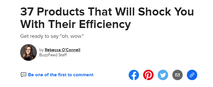
Remove all barriers that would prevent them from completing the action. If you want them to share the content, put a social media shortcut. If you want them to subscribe to your emails, put a signup box on every page of your website. If you want locals to pay attention, optimize for local.
Sure, you can make a whole production about your landing pages and email newsletters to really drive home how much you know about marketing and business, but at the end of the day, all you really want is for them to click that CTA button.
Seduce Them, Don’t Scare Them
I would be shocked to find out that anyone scored a date by jumping out of some bushes in their birthday suit, screeched “I WILL SEE YOU SATURDAY AT 8. BE THERE OR BE SQUARE” like some kind of strange bog warlock, and ran away into the night.
I would be equally shocked to find out that a business that tries to score some of the most valuable digital currency, in the form of personal information, the first time they interact with a customer.
Browsers are becoming more and more concerned with privacy, just as companies are further ramping up their efforts to get at the information consumers are keeping close to the vest.
To overcome that hurdle in the marketing pipeline, brands have to do their own version of a “mating dance.” Don’t worry. It’s less National Geographic and more respecting boundaries while maintaining that alluring je ne sais quoi that makes them want to engage with your brand.
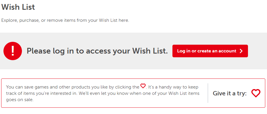
The best way to tackle this is to handle each interaction as a series of escalating steps. If you’re starting with cold leads, immediately asking for a first and last name, mother’s maiden name, and social security number isn’t going to get you very far.
Here’s a specific example:
Let’s say that you are a software company specializing in planners and scheduling tools. You offer multiple products for both personal and professional use in three different price packages: Basic for free, Premium for $25 a month, and Ultra Mega for $75 a month.
If you jump right to a CTA asking organic Facebook leads to try the Ultra Mega package, you’re going to have terrible results. No one in their right mind would pay $75 a month for the product they know next to nothing about. At that point, they aren’t even aware that you offer a free trial or a Basic package. In fact, it’s unlikely that they’d ever find out because they’d be too busy laughing at the fact that you’re asking them for $75.
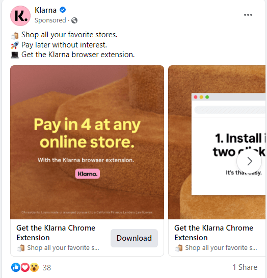
A better tactic would be advertising your Basic package or a free trial of Ultra Mega for free through social media channels. This would pique the curiosity of people who are busy scrolling through Facebook when they’re supposed to be getting things done, immediately giving your product a useful and relevant purpose. Your CTA would say something like “Stop wasting time on Facebook… Claim your free trial of The Procrast-Annihilator.
Then, once they’ve jumped to your landing page, ask them to sign up for an account to get that free trial. Boom. You now have an email address.
From there, you can begin a chain of emails based on customer actions, all with their own engaging CTAs that lead a customer through the sales funnel. For folks who signed up for a free trial, but immediately canceled, send a short survey asking what they thought and offer a second month free for their response. For those who are actively engaged in using your software, gently nudge them towards upgrading to the mid-tier package to try out cool new features.
Only once you’ve wined and dined your prospects can you get down on one knee and propose that they make a bigger splurge.

Use Your Big Kid Words
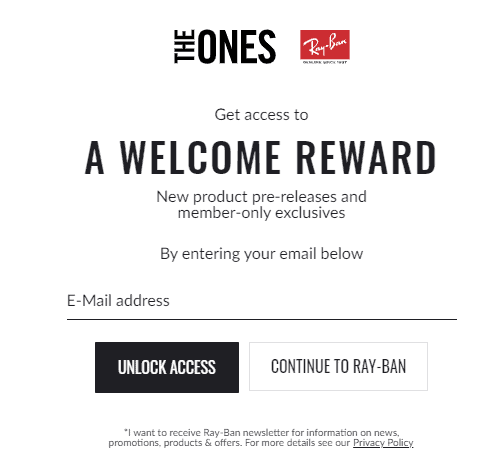
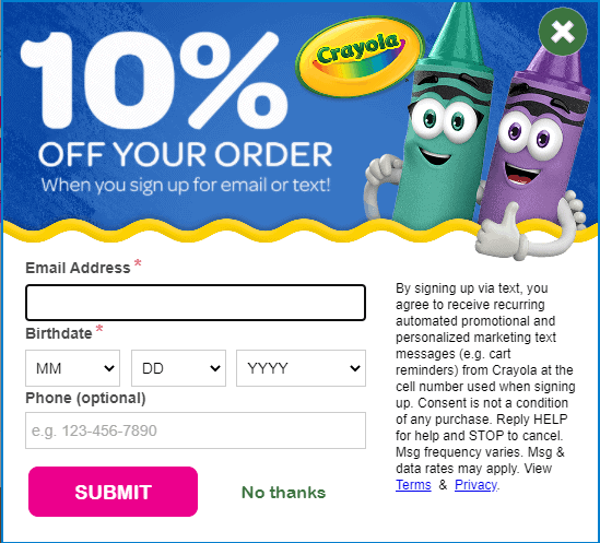
Your CTA needs to be compelling and words like “Submit” or “Click Here” just aren’t going to cut it. It’s time to bust out your favorite thesaurus, crack open a Webster’s dictionary, and get to fluffing up your language.
“But Writer at NATIV3,” you are probably thinking, “Big kid words are scary for people who are engaging in information at the speed of a thumb scroll. Using too much figurative language or uncommon vocabulary will be intimidating, and they’ll pick the other guy with the CTA that’s easier to read.”
And to that, I say “Nay.”
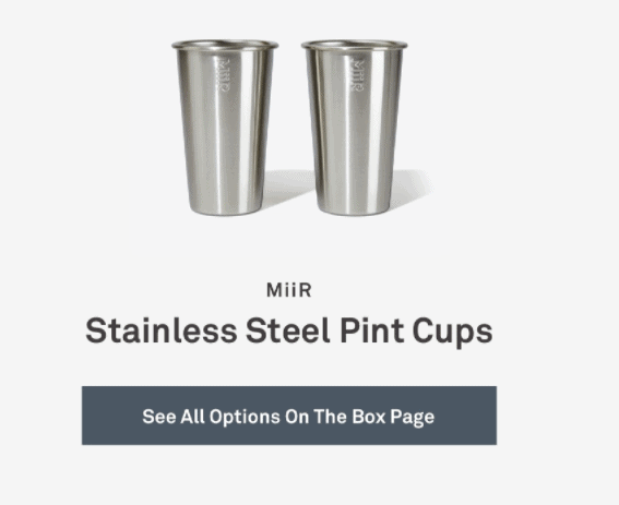
In fact, you’ll stand out more if your CTA doesn’t follow the crowd simply because it’s novel. Make people laugh. Give them some substance to hold on to. Do anything other than label your CTA button with “Read More.”
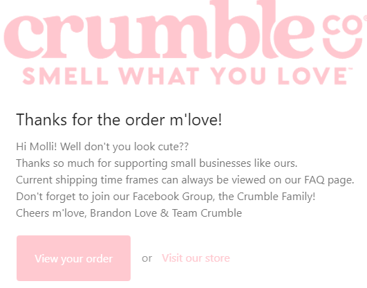
By using humor, interesting wordplay, or even descriptive language, you are humanizing your brand and letting your audience know that there really is a person behind all the copy and content. And that’s a magical thing, my friends.
Call NATIV3 If You Want to Be the ABSOLUTE RADDEST BUSINESS ON THE BLOCK
See? Don’t you want to call us? Don’t you want to be rad?
That’s the power of a great CTA.
But really, click here to snag our phone number, and we’ll get started formulating a killer marketing strategy.