Creepy Kids and Big Hair: A Compilation of Great Old Ads, Part 1
Have room for seconds? Read Part II.
We need to talk.
No, this isn’t about that weird thing you said at the office Christmas party or the “Alpaca Incident of 2014.”
It’s about why vintage ads were so damn creepy.
This question has been plaguing me, and I’m sure millions of others are just as horrified at the creepily rosy cheeks and glassy, lifeless eyes staring back at us from behind a 7Up bottle.
While grappling with these dark thoughts keeps me up at night, I considered the effect the world of 20th-century advertising may have had on the psychologies of vulnerable young minds.
What dark deeds arose because a sweet, innocent child was exposed to the faces of evil before their brains could process that they were just trying to sell some cereal or razors or cigarettes? Could the Campbell’s kids be the true masterminds behind all conspiracy theories we learned about watching YouTube at 3:00 am?
This writer confidently says, “I don’t know, but they’re scary enough for that to be true, tbh.”
I’m no medical professional, but I think the best way for us to come to grips with our heart’s deepest anxieties is to face them head-on.
So, without further ado, let’s take a journey through 100 years of truly disturbing advertising. I’ll be rating each ad on a scale of 1-10, where a 1 is about as creepy as a puppy cuddling with a kitten and a 10 is like a clown watching from the forest and slowly honking a horn that sounds like a child laughing.
Please keep your hands, feet, and imaginations in the vehicle at all times, lest they be snatched by someone with a beehive haircut and a thirst for blood.
The 1900s
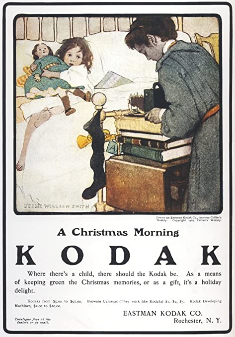
Kodak Cameras, 1904
In exhibit one, a term I use literally as it looks like future evidence in a criminal case, we have some kind of grey-face humanoid clearly preparing some kind of Lovecraftian mechanical device that will put the girl’s soul into the life-sized doll she is holding.
Also of note, the ad says that it’s Christmas… These parents can afford the world’s largest toddler bed and an entire camera worth somewhere between $150 and $2600 in today’s money, could only swing a sad, limp, black sock to serve as a stocking? Interesting priorities, Mr. and Mrs. Imaginary Kodak Ad Parents.
Creep Factor: 7/10
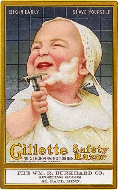
Gillette Razors, 1904
Ah, yes… The old, family tradition of letting your toothless infant lather up and shave while you kick back with an Old Fashioned and a cigarette in the game parlor.
Those were the days when babies, like little Archibald here, could get themselves ready for their Christening, complete with a weird bonnet and matching cult dress. You wouldn’t want your newborn to scratch up Aunt Hildy and Uncle Francis when they come in hot with cheek pinches, so it’s necessary to trim up the whiskers before you head out.
Creep Factor: 8/10
The 1910s
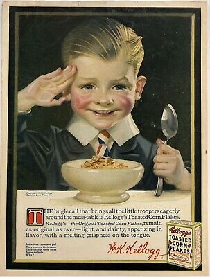
Kellogg’s, 1916
First of all, to imply that dry, tasteless Corn Flakes are the “bugle call that brings the little troopers eagerly around the mess-table” when Rice Krispies existed is laughable. Second, this child clearly suffers from rosacea. Instead of investing in tiny ties for tiny tots, they should have looked into a medicated ointment to get rid of those cartoonishly red, swollen cheeks.
If I could have a word with Mr. Kellogg, I would ask him why his company thought it was a good idea to make this small vampire boy look like he was going to both cry and consume the flesh of his enemies. The last thing I want when my heart is so full of dread is a bowl full of soggy cardboard.
Creep Factor: 8.5/10
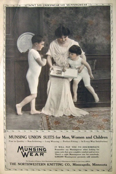
Munsingwear, 1914
Ah, the union suit. It’s like wearing a baby onesie, but for the whole family! According to the small print on this ad, Munsingwear was the OG of rompers and “romphims,” with these bad boys flying off the shelves at the breakneck speed of 8,000,000 per year. This particular ad really tries to play around with the word “union,” showcasing three specters in white reading the Necronomicon together in their haunted mansion. I think a better slogan would have been, “Together in life, together in death, together in Munsingwear.”
I’m surprised that we don’t all wear Munsingwear to this day. After all, who doesn’t want to look like the ghost of a sickly Victorian child?
Creep Factor: 6/10
The 1920s
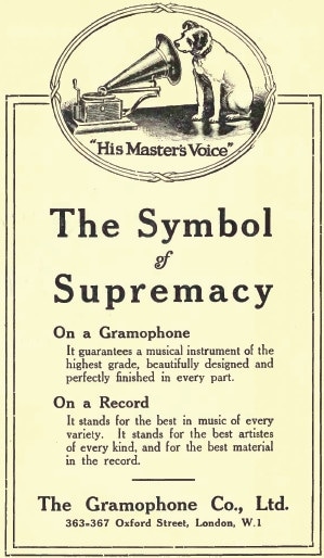
His Master’s Voice, 1924
This one’s less creepy and more… an odd choice to showcase how dope your gramophones are. I have three dogs, all of which are loveable idiots. Truly, they are the world’s dumbest dogs. Their master’s voice means NOTHING to them. I could tell them I brought them a bacon-wrapped ribeye and they’d never take their eyes off of whatever they were doing before I walked in the room. If you really wanted a dog to stick his head in a gramophone, you’d need to play sounds that dogs really care about.
A few suggestions:
- Deli meat slipping out of your hand and making a wet slap on the floor
- A freshly opened bag of chips
- You trying to sleep peacefully without someone’s wet nose touching you
- Other dogs just vibing
- Squirrels, birds, and other small animals that they are too slow to catch but will try anyways
Creepiness Factor: 2/10
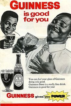
Guinness, 1929
I can guarantee, without a single doubt in my mind, that this would become a meme in a nanosecond if it was released today. That Olan Mill’s style of having yourself look at yourself from behind you, the ridiculous expressions moving from evil villain to cardiac arrest after one sip, the idea that Guinness offers some health benefits… Oh, man, the internet would go to town.
This poor man probably thought he was posing for a PSA on the dangers of accepting drinks from your menacing doppelganger. Shoutout to him for the acting skills on having a tummy ache due to arsenic poisoning, if that was the case.
Creep Factor: 6/10
The 1930s
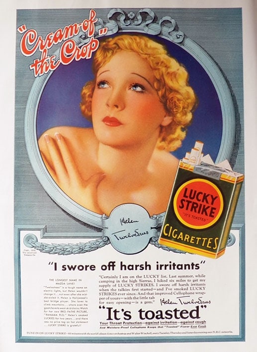
Lucky Strike, 1932
I try not to spend too much of my life being dramatic, but I feel this is one of those times where it’s appropriate.
This woman is truly the most terrifying thing I have ever seen in my life. It looks like her face was sandpapered off, then drawn back on with Crayola markers. She looks like if a porcelain doll came to life, murdered you, and then spent some time reflecting on her choices in the mirror. If anything, this ad makes me fear for my life if I ever even glanced at a Lucky Strike cigarette.
Instagram filters who? Nah, we got the Lucky Strike ad executives to give me the smooth skin of a baby seal and the cold, unfeeling eyes of a taxidermied rodent.
Creep Factor: 9.5/10
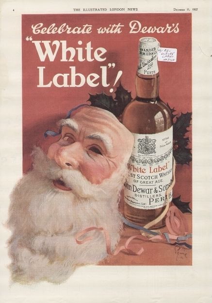
Dewar’s, 1937
Clearly, the marketing industry was drinking a bit too much Dewar’s in the 30s… Between the Lucky Strike lady and this absolutely chilling Santa Claus mask, it seems that the national obsession had become the ability to shed your skin like a lizard.
The premise of the ad makes sense… Christmas party, someone’s dressed up like Santa, he takes his mask off to sip on some Dewar’s, gets so toasted that he never puts it back on. Fine. I get it.
But why the entire face of the jolly old elf? Why not a beard? A hat? Hell, a single red mitten with fur trim would have done the job. But, no. We had to go all “Silence of the Lambs” with the flayed flesh of St. Nicholas.
Creep Factor: 9/10
The 1940s
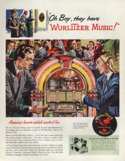
Wurlitzer Music, 1946
At first glance, this isn’t so bad. A hoppin’ restaurant, a few good friends, and a Wurlitzer jukebox… What more could you ask for?
Personally, I could ask for those two folks in the front to not look like they are in a battle of will for control over the entire earth’s resources. They are not looking at each other like they can’t decide whether or not to play “Don’t Stop Believing” or “Rocket Man.”
No, they look more like one of them just played “Tub-Thumping” by Chumbawumba out of spite, and now someone’s about to get curb-stomped.
I’m going to put my money on the lady. Showing teeth is a sign of aggression and dominance in primates. This is King Kong vs. Godzilla, but without the heartwarming romance (that I created in my own head). One of them’s about to die, and the other one’s going to take out the world with laser breath. This is the apocalypse we were warned about, but the world didn’t listen.
Creep Factor: 8/10
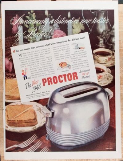
Proctor Toasters, 1948
Again, we’re talking less about creepiness with this Proctor Toaster ad, but something needs to be said about that absolutely ridiculous, white script on top of a busy, floral background. That mess is so hard to read, I wouldn’t be surprised if it was a chant that raises the dead or launch codes for global warheads.
This ad makes Proctor look like they were actively trying to PREVENT people from seeing the text. A couple of theories I have:
- Jim from Accounting chose this slogan but got told no. In an act of revenge, he bribed the design team to include it but couldn’t risk losing his job. Thus, they made it nearly impossible to decipher.
- It’s an early prototype for one of those magic pictures that you have to cross your eyes and move your head to see.
- “It looks fancy and fancy is good, so this looks good.” Right? Right, guys? Please say this looks good… I already sent it to the printers…” -Clifton Crackerjack, who was never seen again after Proctor executives saw that this ad had been run in national periodicals
Creep Factor: 7/10 when you consider what happened to poor Clifton…
More Creep to Come
We’ve only made it through the 40s, with five more decades to cover next week… I figured we could all use a restroom break, maybe grab some Gatorade and a PB&J before we get to the weird hair-raising brown color palettes of the 70s.
In the meantime, don’t let these kinds of marketing mistakes make it onto a list of bad ads in the distant future. Give NATIV3 a call, and we’ll help you create marketing campaigns that won’t haunt anyone’s dreams… Unless that’s what you’re going for.