Jell-O Fish and Hairy Men: Great Old Ads Part 2

Want even more horror? Start with Part I.
Last week, we had the thrill and the privilege to plumb the depths of some of our nation’s greatest treasures: ads with horrifying children and questionable marketing messages.
As World War II and the Great Depression came to a close, so too did the era of monster children splashed across the periodicals of America.
A more mature… more sensual advertising landscape was upon us… It was a time when rugged men in funny-colored pants and strange, mayonnaise-forward recipes could peacefully coexist in the glossy pages of Vogue, Life, and Reader’s Digest. And while things were markedly less horrifying in the, “Oh, God, I hope I don’t see the Kellogg’s kid staring back at me from under my bed one stormy night” sense, they still left me pondering what in the world brands thought they were doing.
Thus, I have changed my rating scale from “Creepiness Factor” to “Number of eyebrows raised.” It represents the questionable, yet intriguing, nature of ads from the postwar era all the way through the bodacious 80s.
The 1950s
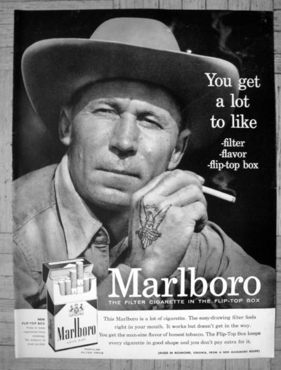
Marlboro, 1956
Remember when people thought that smoking cigarettes would make them look cool?
It was almost definitely this guy’s fault.
Between that sick hand tat and those squinting eyes that say, “Yeah, I could build you a ranch home and bring you flowers on our anniversary,” it’s hard to resist the Mona Lisa-esque allure of the OG Marlboro Man before the title became official in the 60s.
This is an example of marketing that’s grown too powerful. Sure, they didn’t know back then about all the damage smoking could do, but here I am, in modern times, wishing that I could live in ignorant bliss while enjoying “the filter cigarette in a flip-top box.” Sigh.
Number of eyebrows raised: 3/10 for kind of making me want to lean against a saloon wall in a cowboy hat and take a long drag off of a Marlboro.
Coca-Cola, 1958
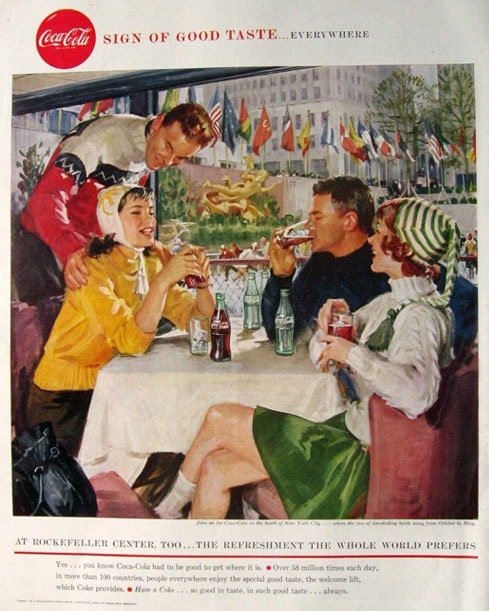
Cute concept, weird execution.
So, the basic premise is that anyone anywhere can enjoy Coca-Cola. Sure thing. I totally agree.
My concern is that poor girl in yellow. Her smile says, “Nice to see you,” but her eyes are screaming, “Please Sharon, get me out of here.” Biff in the back there is invading her personal space at a table clearly set for three, and that’s not cool anywhere, including Rockefeller Center.
This feels like less of an ad for Coke and more of an ad for using a secret passcode to get away from a creepy dude in a bar. Truly, I am so distracted by the side-eyed look of fear on that girl’s face that the actual product means nothing to me. I can only think about what dark secret she knows about Mr. Touchy-Feely, like his status as a reptilian overlord or the fact that he never calls after the third date.
Number of eyebrows raised: 6/10 out of concern for the health and well-being of that poor woman.
The 1960s
Jell-O, 1964
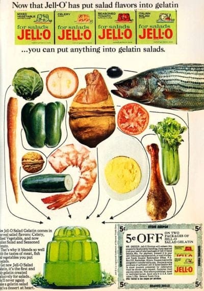
This nauseating Jell-O ad posits that you can “put anything into gelatin salads,” but never stopped to ask if you should.
In an effort to (for some reason) encourage folks to eat gelatin for dinner, the company released a series of savory flavors, including tantalizing mixed vegetable, scrumptious celery, deliciously seasoned tomato, and, of course, the mouth-watering Italian salad variety.
And no new product launch is complete with ads to match! In your new approach to jiggling foods, they suggest adding things like an entire fish, half of an onion, or a bone-in chicken leg.
“Dear author,” you may think to yourself… “Of course, they don’t intend for you to put those foods into Jell-O whole, and instead to prepare them appropriately.” To that, I say that there is as much likelihood of me eating the items chopped into Jell-O as there is me eating it whole– That is to say, zero chance.
Maybe I’ve too modern of a palate, but I believe the only things that belong in Jell-O are a nice fruit cocktail blend or a dollop of whipped cream. The 60s can keep their cucumbers, black olives, and tail-on shrimp.
Number of eyebrows raised: 10/10 because this is truly too horrifying to imagine someone presenting at a nice family dinner.
KFC, 1968
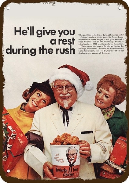
Again, the premise of this ad is benign enough… Christmastime is busy and hectic, so let KFC take care of dinner. It’s a nice enough sentiment.
I’m more concerned about the look of lust that these women have for that wrinkly man in the crisp white suit. It’s too similar to the face moms across America made when they cast Jason Mamoa as the new Aquaman. But, at least Mamoa has abs.
I can assume that the only thing the Colonol has on his stomach is streaks of chicken grease and sprinklings of 11 different herbs and spices.
Number of eyebrows raised: 8/10 because they tried to make the Colonel a lil’ sexy, and it makes me uncomfortable.
The 1970s
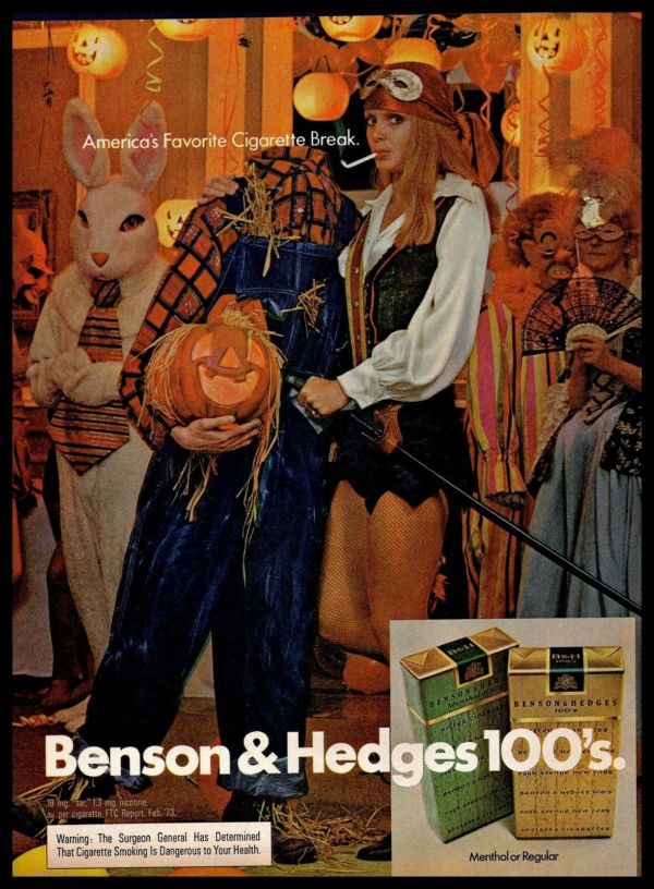
Benson and Hedges, 1973
Not to beat a dead horse, but what is it with the advertising industry that insists women’s eyes should always be crying out for help? They overshot “Damsel in Distress” and landed squarely in, “Someone please call the police.”
I think there should be a new, retroactive rule: If you can put a blindfold on the main person of your advertisement, and it looks like they’re about to encounter the firing squad, you have to start over.
Don’t even get me started on the haunting, dead eyes of that rabbit or the snarling clown. I understand that Halloween is supposed to be creepy, but this feels like I’ve walked in to something I’m not supposed to, and now I’m going to be killed for knowing too much.
Thank goodness I’ll at least get a Benson & Hedges 100 before I go.
Number of eyebrows raised: 17/10, all around terrible.
The 1980s
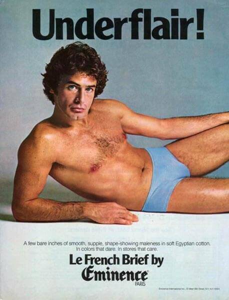
La French Brief by Eminence, 1980
The smoldering glance, the cleft chin, the gentle wave of chest hair… Is this a Grecian statue or a hairy man advertising underwear?
I’ll concede that I’m not raising any eyebrows about the picture. I’ve seen much more questionable material in the 90’s Got Milk campaigns.
What’s really got these eyebrows poppin’ is the statement underneath of the man: “A few bare inches of smooth, supple, shape-showing maleness in soft Egyptian cotton. In colors that dare. In stores that care.”
Boy, Eminence, leave some adjectives for the rest of us.
Number of eyebrows raised: 4/10– Not terrible, but I’d rather not look at it for too long.
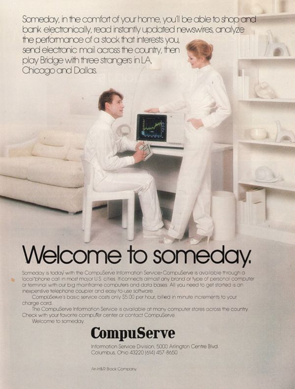
CompuServe, 1983
Sweet, silly CompuServe shot for futuristic and landed firmly in “cultlike” with this daring advertisement drenched in white.
I’m proud of them for predicting the future of computing power, but it all seems a little less optimistic and a lot more ominous when the message is coming from a woman wearing socks with stilettos and a dude in a turtleneck sweater.
The main issue is that with a house like this, you know these models of Robert 2.0 and Brenda XL 50 can’t possibly have any pets, children, or fun. Image dropping a bowl of spaghetti in this room… It would look like an episode of CSI about a cult murder. Not interested.
Number of eyebrows raised: 8/10 because someone should probably call their families and let them know what happened to these folks.
Marketing without the Questionable Material
Ethical marketing is hard. Balancing irreverent with offensive, charming with manipulative… Even the pros can struggle with it. If you want to avoid making a future top-10 list of eyebrow-raising ads, keep us in mind. NATIV3 can help you build catchy, scroll-stopping campaigns that win over customers and sell your brand. Let’s get started!